




Game cards Improvements
 View image 2 of 6 from this article
 View image 3 of 6 from this article
 View image 4 and 2 more from this article
 View image 5 of 6 from this article
 View image 6 of 6 from this article
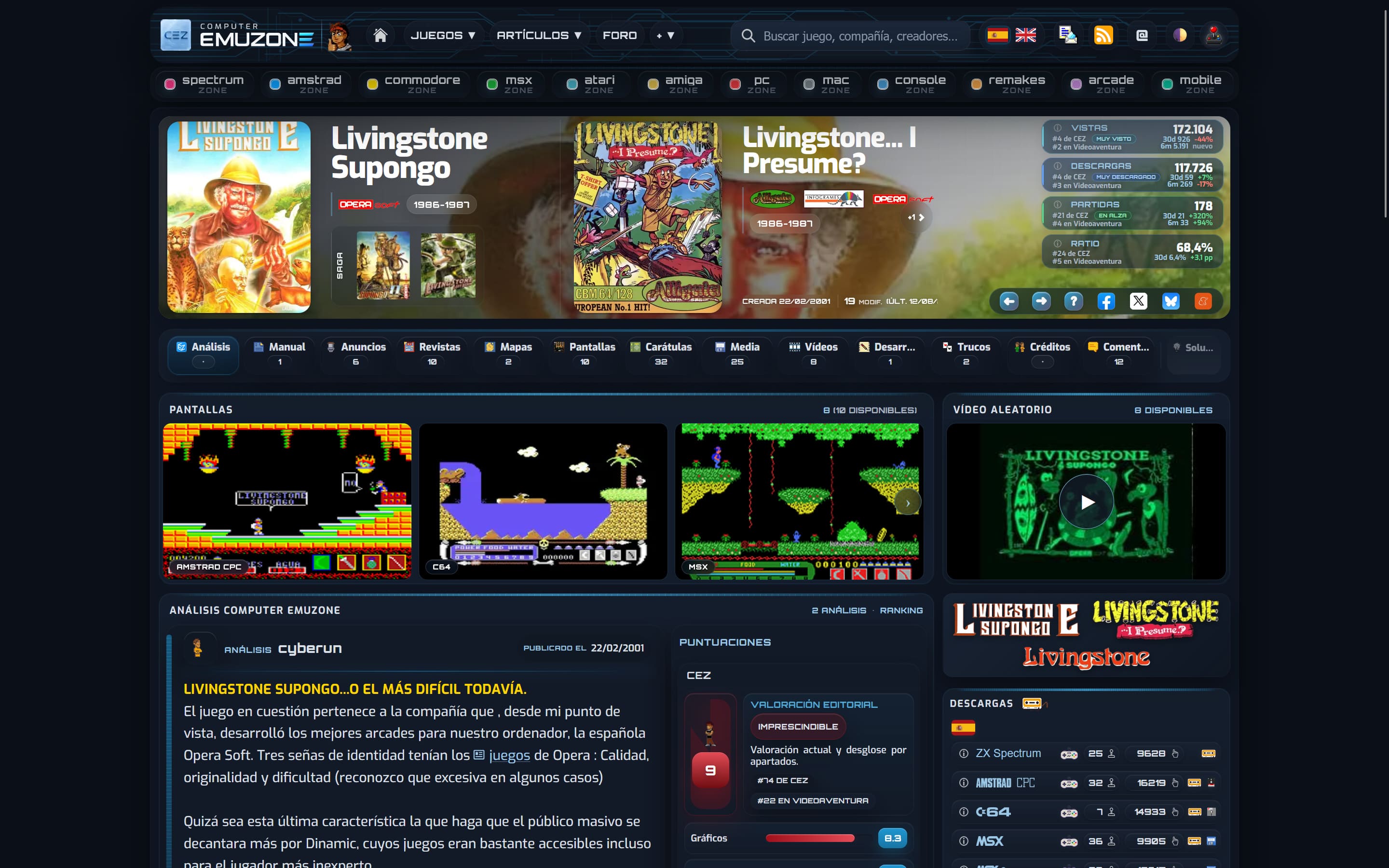
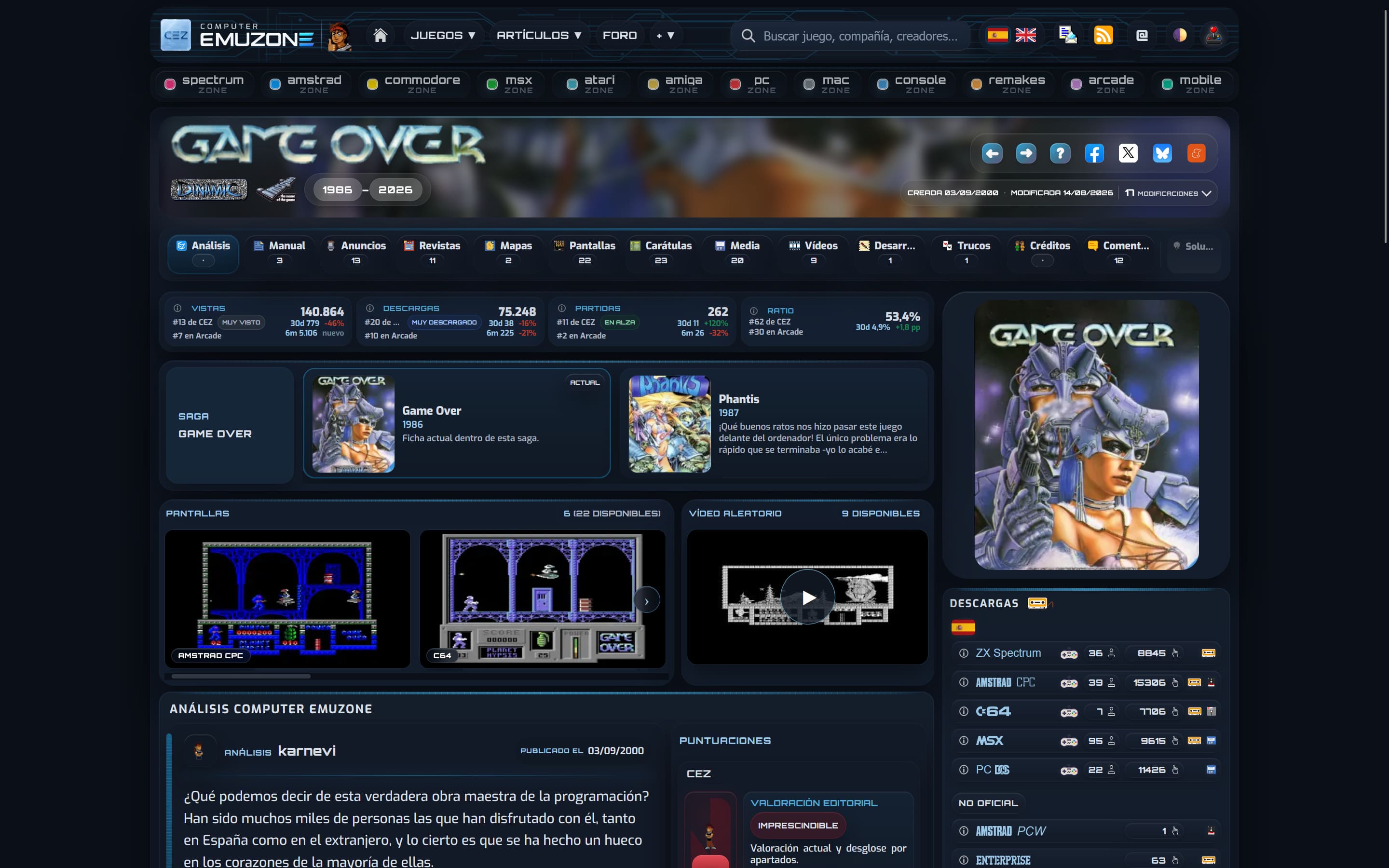
Over the past few weeks, we've been working on a further revision of the game information pages, aiming to make them more comprehensive, clear, and user-friendly on computers, mobile phones, and tablets.
The main improvement lies in how different editions of the same game are handled. The game information now allows for better differentiation between versions that share a title but differ in subtitle, alternative name, publisher, year, cover art, language, or age rating. This is especially useful for games released differently depending on the country or platform.
We've also reorganized much of the header information. The different editions are presented more visually, publishers and years can be viewed directly from the game information, and the representation of re-releases, unofficial versions, and other release-specific data has been improved.
The sections for screenshots, videos, downloads, series, collections, and related games have also received design and navigation updates. On mobile devices, scrollable lanes and visual indicators have been added to make better use of the available space without disrupting the natural order of the content.
Furthermore, the editing panel has been expanded to allow for more precise management of each version's specific data: language, specific subtitle, alternative name, cover art, PEGI/ESRB rating, Internet Archive link, and publisher affiliation.
The update also includes numerous internal adjustments, compatibility fixes, accessibility improvements, and a general debugging of the game's code.
As always, we will continue to address any issues that may arise as these improvements are used in more games and different situations.
 It's been more than two months since we entered the 26th year of CEZ... To commemorate the end of the 25th year, we've created a dark mode (you can select it in the bar above), the usual colors of the page in its beginnings. We hope you enjoy it.
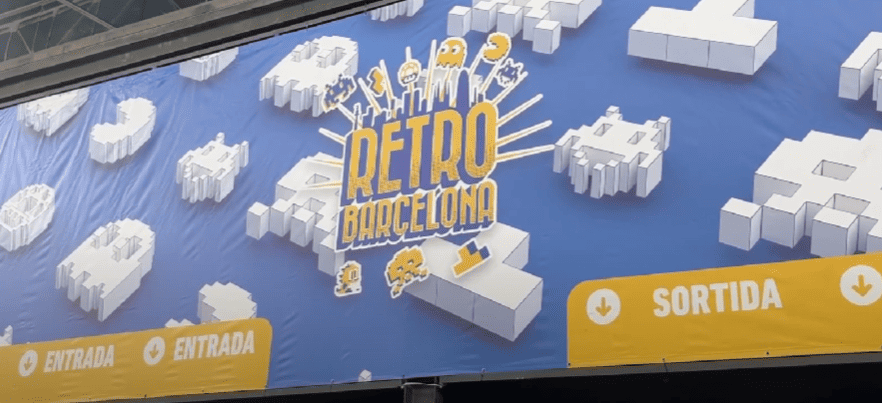 Another year, we have come to Barcelona, specifically to Hospitalet de Llobregat, to attend a new edition of
  We have been mulling over the need to give the main page a touch-up for some time, to give more visibility to the content, and a few days ago we finally got around to it. There are two new features, beyond the aesthetic changes: a new box where you can see the latest added cards (not the reviews, which remain where they were) and the recovery of the news in a prominent place. First, because the time to write needs inspiration, but to add cards it doesn't, and it is something we have been doing without the necessary notoriety. Second, because we can write on social networks, but it is also important that the information is in its place of origin. The idea is to go deeper into automation, so that everything is fluid and does not involve an excessive effort. We are on the way.
 We have a new Twitter account; in it we explain how we knocked down the previous one: D. So if you missed not receiving news, you are slow to follow us ... And if not, too ;):
  We have recovered the fantastic illustration made by Pagantipaco (Retroworks) in 2008, to celebrate this Christmas.
 Finally, the moment of


